

Colour Psychology in Retail Design
The most significant part of retail design is the choice of colours. Colours directly impact the way people perceive retail stores around them. It affects how long people decide to stay at the store, what kind of experience they have, and ultimately whether they choose to make a purchase.
According to statistics from Design & Decor Lab, 80% of consumers believe that colours used in retail design can increase brand recognition. Similarly, about 62% to 90% of consumers say they subconsciously judge a retail environment based on its colour within the first 90 seconds of viewing the store. This suggests that a retail design plan should focus heavily on the store’s colour palette. Colours create a unique environment and play the role of conveying the brand’s personality to customers.
Let’s take a look at what different colours represent and why brands are likely to use them.

Blue:
Blue brings out feelings of trust, dependability and calmness. Brands that use blue have a mature or professional tone and are likely to sell technology-related products. The PlayStation store, for example, uses both white and blue in its retail design. While white is used as the background colour for the store, blue is used to highlight the displays.
Yellow:
Yellow brings happiness, excitement and optimism. It’s the first colour that people notice. Interestingly, it’s also a colour that increases appetite, which explains why brands such as Mcdonald’s use it in their logo, branding and at their restaurants. In terms of retail, Nikon is one such store that uses black and yellow in its logo and its retail stores. This colour can get too overpowering if used alone, so it is best used as an accent colour to brighten specific areas of the store.
Red:
Red invokes a sense of urgency. It is a powerful colour and can mean different things to different cultures. In Chinese culture, red symbolizes prosperity, while Western culture utilizes it to attract attention and views it as the symbolic color of love. In the context of retail design, stores frequently employ it to boost sales. Similar to yellow, red should also serve as an accent color.
White:
White is a colour associated with purity. It represents honesty, minimalism and anything modern. Apple is a classic brand that has a white logo and also uses white in its retail design. This, along with the store’s layout gives it a very minimalistic look where the design is focused on highlighting Apple’s products.
Black:
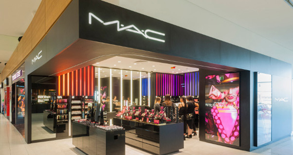
Black is used by brands that want to portray themselves as sophisticated and elegant. Cosmetics brands such as MAC and Bobbi Brown use black in their retail design, logo and their packaging. MAC stores, for example, use black as the primary colour of the walls and displays. This is complemented by bright multicoloured lights to attract customers’ attention.
Green:
Green is the colour used to represent anything associated with nature, peace and health. It’s a colour often used at retail stores, as well as grocery stores, cafes and restaurants. Rolex is one such brand that has incorporated green in its logo and retail design. As you can see below, the green-coloured displays and furniture give the store a regal look.

Colour as an effective medium in Retail Design
Colour interpretation around the world
Colours signify different things in different parts of the world. Green represents infidelity in Chinese culture, whereas it signifies good luck in Western culture. Similarly, while retail stores in the US commonly use black, retail stores in China rarely incorporate it as an attractive color.
Achieving the proper colour balance
Retail stores often use a combination of colours to design their stores. The rule is that no single colour should overpower other colours. This is especially true when using bright colours like red. You can use calmer, lighter colors for most of the designs, but it’s ideal to complement them with accents of either bright or dark colors.
Colours come in tunes
Colour needs vary depending on the size of the retail space and even the time of the day. There is an emerging trend seen with retail stores changing the tune of the colours to display merchandise appropriately. Stores can either tune their colours to white or full colours. You can also adjust the colors from dim to warm, ensuring that the displayed merchandise remains visually appealing regardless of whether it’s day or night.
Retail designers consider colour choice to be one of the most significant parts of the design process. One last tip is to include the logo colours in the retail design so that the colours truly represent the brand and consumers will start to associate those colours with the brand. Retail designing is a highly strategic step for brands. When done well, it has the potential to build brand loyalty and enhance the brand’s reputation. All in all, planning retail design carefully, while considering the brand’s tone, personality, and customer preferences, is crucial.
Follow us on:


